Showing posts with label Research. Show all posts

Tuesday, 10 April 2012

Tom Frost


So I came across Tom Frost at Pick Me Up during my Time in London, the whole exhibition was pretty good, but this was one of the illustrators that stuck in my head and that I was most interested in and inspired by!

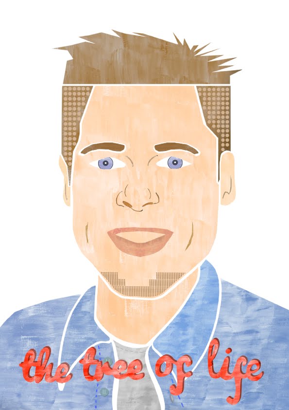
The thing I like most about this guys illustrations, is obviously the shapes! lots and lots of shape, which works well screen printed. I also like that in most pieces there is a slight bit of pattern, which I can relate with my work as I have started to do this in my work, starting with my Brad Pitt Portrait from last semester. And now with my rapunzel and grimms book covers, I have some repetative shapes going on.
I also like the use of character. The human characters are done really well and this is something that I have struggled with for a while but really want to figure out before I graduate! Hopefully Tom Frost can be my inspirationg for this!

Sunday, 26 February 2012

Max Dalton

So after talking to Nicola Slater about my portfolio, she mentioned an Illustrator called Max Dalton, saying he seems to work in a similar way to I, and she said how she loves how he has very little detail on his characters faces, just simple 'U' like shapes for the eyes, So i decided to take a look at his work and I think it is brill, from first glance his characters made me smile, very simple, simple shapes, simple colour, simple lined detail and having a route through the work on his website, certain things made me like this illustrator even more, firstly, seeing an illustration his produced based on Kill Bill, (which was strang as a few days before I had watched this film!) it took me a while to realise what the image was, but when I finally did, It made me smile.


He also did two images based on a film called The Big Lebowski, which I am a big fan of. I think these pieces were movie posters he had created, and they work so well, alot of pattern in one and lots of character in the other, they are brilliantly done and the use of colour works really well.
Also there was a poster for Pulp Fiction, people would say this is a classic film and it is one to watch and I recently watched it (after meaning to for a while now) and I really enjoyed it, and I love seeing work based on things I like, it draws me in more, and all these pieces drew me in to Dalton's work even more.


I'm going to try and get in touch with Max and see if he can take a look at my work (via my website as he lives in America) and see if he can give me any advice and constructive criticism.

Wednesday, 22 February 2012

Book Binding


Yesterday (21st feb) Lucy Wilson came and taught us how to bind books, at first I thought this is going to be a pain and that I would not be interested, but I actually thought it was really interesting and fun and easier than I thought it would be, so I would hopefully be able to make some more books in the future, hopefully containing my own work, would look pretty cool and much more personal than a bought sketchbook (which is what I usually keep all of my work in!)

To attatch the pages together we did the cool stitching technique, looks complicated but it's pretty easy once you get the hang of it, (after the first few pages) I'm a messy bugger so I don't think mine came out perfectly and it felt really loose before I put some glue on it, but after a couple of practices I think I could easily put together a perfect cute little book. Was a good and very helpful workshop! Which i'm glad I attended and i'm glad I had the opportunity to learn this fun and useful technique!

Tuesday, 7 February 2012

Kotori

http://vimeo.com/17672714

this animation is similar to something I would like to do with my work, lots of shape and easy movements, i think i would possibly like to do most things digitally as my work, works better this way.

PES


Pes animation are very unusual and interesting, I always get sucked in when watching a clip done by them, the usefulness of objects is amazing and they make it work so well, get imaginative ideas and sound effects

Vincent by Tim Burton


As you all now already know, I am a huge fan of Tim Burton's art work and films, including his animations, this is a short animation he did with Rick Heinrichs. Along with his other animations, The Nightmare Before Christmas and The Corpse Bride, Burton makes models of his characters and photographs them to create movements, some of the models are tiny robots which is a very interesting way of doing an animation, making 3d models aod cut outs for his backgrounds. This is a short story about a boy with an exciting imagination, who flips back a forth from reality to a fantasy where he is Vincent Price. Though my work is nothing like Tim Burton's and my animation (if I succed) Will hopefully be a colour one unlike this dark mysterious one, Vincent has always been an inspiration to me.

Screen

This is a short video directed and produced by my friend Theo Kirkpatrick, it is a piece he did for his FMP for a media course he did at The Manchester College, It is about an interest in gaming is taken too far, it is a mix of real life film and animation, interestingly done and put together and is also very fun and cleverly done.


I love the simple shapes and characters and they way they move, very simple and not too fast or confusing and I also like some of the fading effects used (when the wizard fades and dissapears) very interesting

Monday, 6 February 2012

How The Very Hungry Caterpillar is our favourite and most widely read children’s book:

Found this interesting Article on children's book, thanks to Chloe Jones.

How The Very Hungry Caterpillar is our favourite and most widely read children’s book: Cinderella, Postman Pat, Fireman Sam and Spot the Dog also make the top 10!

By Daily Mail Reporter


He’s been munching through fruit, cake and sausages for more than 40 years…but children still haven’t lost their appetite for The Very Hungry Caterpillar.

Eric Carle’s 1969 tale about a caterpillar that becomes a butterfly is the most read children’s book in Britain, a study revealed yesterday.

Researchers estimate it is read an average of nine times a year by the nation’s 5.5million primary school children.

Nation's favourite: The Very Hungry Caterpillar, first released in 1969, is still British primary school children's most popular book, with nine reads each year

Nation's favourite: The Very Hungry Caterpillar, first released in 1969, is still British primary school children's most popular book, with nine reads each year

The second most popular book is the Cinderella fairytale, read around 8.7 times a year, according to the poll of 2,000 parents.

The report, commissioned by the Early Learning Centre, also found parents actively encourage their children to read books they enjoyed as youngsters, prompting the comeback of a string of classics.

Popular: Books about Postman Pat, and his trusty cat Jess, came in at fifth in the poll with 7.49 reads each year

Popular: Books about Postman Pat, and his trusty cat Jess, came in at fifth in the poll with 7.49 reads each year

Yesterday Nicki Tracey, Head of Brand Communications for the Early Learning Centre said: 'A huge amount of parents are familiar with the story of The Very Hungry Caterpillar and it’s a book that has obviously been passed down through the generations.

'It’s great to see so many books on this list that parents have obviously enjoyed themselves as children and as a result encouraged their own children to read and love as well.

'It’s especially good to see that so many parents and children enjoy reading these stories that they re-read the same books over and over.

'Reading boosts children’s development, teaches them new words and helps them discover and learn about the world.'

The third most read books were Roger Hargreaves’ Mr Men series followed by the Peppa Pig books based on the Channel 5 TV show and John Cunliffe’s Postman Pat adventures.

Parents and children read about Postman Pat’s adventures an average of 7.5 times a year while The Gruffalo, Julia Donaldson’s animated modern fantasy about a fictitious monster who lurks in the woods, is likely to be read at least seven times a year.

THE MOST READ CHILDREN’S BOOKS

(The figures are based number of times each book is read a year per household)

1. The Very Hungry Caterpillar - Eric Carle 8.85

2. Cinderella - Various 8.71

3. Mr Men - Roger Hargreaves 8.41

4. Peppa Pig - Various 7.72

5. Postman Pat - John Cunliffe 7.49

6. The Gruffalo - Julia Donaldson 7.48

7. Fireman Sam - Various 7.43

8. Spot the Dog - Eric Hill 7.39

9. Biff, Chip and Kipper - Roderick and Cynthia Rider Hunt 7.31

10. Horrid Henry - Francesca Simon 7.25

Roald Dahl’s 1964 Charlie and the Chocolate Factory, Dr Seuss’s 1957 book The Cat in the Hat and the 1980s Spot the Dog series also made the top 20.

The study also found most parents said their children picked up a book and either read to themselves or got their parents to read it every day.

And ninety per cent claim their children read or were read to at least three times a week.

Parents also agreed that sons and daughters had very different tastes when it came to their reading habits but both preferred adventure stories.

One in five parents admitted to bribing their children to read by offering them pocket money.

Technology has also had an impact on how children read with more than a quarter of parents saying their child had read a story on an e-reader.

The poll also found 12 per cent of parents said their offspring liked reading books based on films or TV shows.


I thought this article was quite interesting as I have decided to create a book cover for Cinderella as part of my FMP and to find out that it is one of the most read children's books has given me another push to work even hard to produce a new cover for the story with out repeating what has already been done, creating new ideas and something different in style. Wanting to keep the cover child friendly, i also want to make it quite dark as most of the covers I have seen for Cinderella are all happy and magical, but the story also has dark and saddening plots and events. I do want to keep the illustrations quite literal as it is a children's book and going metaphorical or too illiterate might make it too confusing.

It is also nice to see that Biff, Chip and Kipper, one of the series of books I used to read as a child, still in the top ten most read books! It was one of the well known series of books when I was a kid and it's good to see that children are still reading them, considering children's tv shows have completely changed, I did not think many of the books I read as a kid would still be well known, Postman pat has always been a favourite of children, but the tv show has completely changed, it is just not the same anymore.

The Mr. Men series as still as good as ever, simple shaped characters that are so lovable!


Saturday, 4 February 2012

Maggie Li


Textures, Textures, Textures!!! I like that the shapes of some of these are not perfect, result of screen printing i'm guessing! Really need to start screen printing! I think it will work really well with some of my work and i will get results similar to these works.

Frann Preston-Gannon


Frann Preston-Gannon's skeleton work gave me an idea for part of my Rapunzel book cover, as I wanted to illustrate all the men that have tried to save her from the tower, and I want to illustrate this by adding skeletons to my imagery and Frann Preston-Gannon's work inspired this idea. These are the skeletons that I have created so far, but I am thinking of screen printing these, as I think that if the ink runs a little bit it may give a nice feel to them and then they will not look so 'perfect' as skeletons are usually rotting and not perfect shapes. So screen printing might give a nice textured feel to them.
I also like the backgrounds on the top two skeleton images (coffin ones) having different shades and strips of one colour instead of one colour in the background, gives more depth and patterened feel to the imagery and makes the lighter colours stand out more.

Alice Lickens


Alice Lickens is a freelance illustrator & designer based in London also working as one fifth of Zombie Collective.
Lovely use of textures and shape, as i've mentioned in earlier posts this is what I work well with so I like to look at illustrators/artists that do this well, that will inspire me and my work and help me spark new ideas and possibly new ways of working and development.

I like the use of pattern and shape in the "atoms" pieces, they are unusual but it is nice to see some sciency illustrations!

Kancho

A random shopping trip to ASDA, found these cute little biscuits! with cute little illustrations on the packaging.

Nicola Slater

Unfortunatly, I wasn't able to attend the talk by Nicola Slater, but as she is a professional childrens book illustrator I had a little nosey at some of her work.
I really like her work, the use of shape and texture is inspiring as I am becoming very comfortable using these, her child like animal characters are so much fun and child friendly, such simple shapes make very detailed characters.

I also love her typography, she seems to have many different styles of typography, and they all seem to somehow fit in perfectly with her imagery, even though they are done in a different style. I always try to make my typorgraphy in the same style as my imagery, but I can never get it right, maybe I should try something completely different and fit it in some how, in a similar way to Nicola,


She is a very interesting illustrator, her work inspires me and makes me feel good about my own work.
As I am quite interested in childrens book illustration, I may email Nicola and see if she would take a look at some of my work and give me some advice.

Her use of colour is also interesting, nothing to bright and alot of pastle colours seem to be used which work quite nicely and are not too bold and taking over the imagery.
I also like her use of shading and shadows, which is something I don't usually think about when illustrating, but when drawing I also add lots of shading, maybe this is something more I could add to my illustrations to give them a little more depth and make them more interesting.

Sunday, 18 December 2011

Little White Lies

For the competition brief I decided to do a magazine cover for Little White Lies magazine, choosing the film The Tree of Life:

The Tree of Life is a 2011 American drama with experimental elements written and directed by Terrence Malick and starring Sean Penn, Brad Pitt, and Jessica Chastain. Malick's film chronicles the origins and meaning of life by way of a middle-aged man's childhood memories of his family living in 1950s Texas, interspersed with imagery of the origins of the universe and the inception of life on Earth. After decades in development and missed 2009 and 2010 release dates, the film premiered in competition at the 2011 Cannes Film Festival, where it won the Palme d'Or. The film received polarizing reactions in response to Malick's use of technical and artistic imagery, directorial style, and fragmented non-linear narrative.


A mysterious, wavering light that resembles a flame flickers in the darkness. Mrs. O'Brien (Jessica Chastain) recalls a lesson taught to her that people must choose to either follow the path of grace or the path of nature. In the mid 1960s, she receives a telegram informing her of her son's death at age 19. Mr. O'Brien (Brad Pitt) is notified by telephone. The family is thrown into turmoil. In the present day, Jack O'Brien (Sean Penn) is adrift in his modern life as an architect. When he sees a tree being planted in front of a building, he begins to reminisce about his life as young teenager during the 1950s.

The universe is formed. As the galaxies expand and planets are formed, voices ask various existential questions. On the newly formed Earth, volcanoes erupt and microbes begin to form. An Elasmosaurus, a large wound in its side, gazes out to sea. In a forest, a young Parasaurolophus is wary of predators. Later on a riverbank, the Parasaurolophus lies wounded. An Ornithomimus[3] emerges and examines the wounded dinosaur. The Ornithomimus places its foot on the Parasaurolophus' neck, preparing for the kill, but then reconsiders after watching it struggle. The predator wanders off. An asteroid impacts the earth.

In a sprawling neighborhood in Waco, Texas, live the O'Briens. The young couple are enthralled by baby Jack and, later, his two brothers. When Jack (Hunter McCracken) reaches adolescence, he is faced with the conflict of accepting the way of grace or nature, as embodied by each of his parents. Mrs. O'Brien (grace) is gentle, nurturing, and authoritative, presenting the world to her children as a place of wonder. Mr. O'Brien (nature) is strict, authoritarian, and easily loses his temper as he struggles to reconcile his love for his sons with wanting to prepare them for a world he sees as corrupt and exploitative. He laments his decision to become an engineer rather than pursue his passion of becoming a musician, and now pursues dreams of wealth by filing patents for various inventions.

One summer, Mr. O'Brien takes a trip around the world in an effort to commercialize his inventions. While he is away, the boys enjoy unfettered access to their mother, and Jack experiences the first twinges of rebelliousness. Goaded by other boys his age, Jack commits acts of vandalism and animal abuse. He later trespasses into a neighbor's house and steals her underwear. Jack is confused by his experiments with violence and experiences guilt, throwing the stolen underwear into a river to rid himself of it. Mr. O'Brien returns home, having failed to sell any of his inventions. Shortly thereafter his plant closes and he is given the option of staying with the company and relocating to work a stable yet unfulfilling job, or be terminated. Mr. O'Brien agrees to the transfer and he and his family pack up to move. Mr. O'Brien laments the course his life has taken, questioning whether he has been a good enough person. He reconciles with Jack, asking forgiveness for his harsh treatment of him.

Far in the future, the planet Earth is destroyed, first burnt to cinders by the sun when it has turned into a red giant and then left alone as a desolate, lifeless frozen place still orbiting around the sun, which by that time has turned into a feeble white dwarf.

In the present, adult Jack leaves work. Riding the elevator down he experiences a vision of walking on rocky terrain. He tentatively walks through a wooden door frame which is erected on the rocks. On a sandbar, Jack is reunited with his family and all the people who populate his memory. His father is happy to see him. His mother is overjoyed when Jack's memory resurrects his dead brother. She thanks Jack, kissing his arm twice. Jack's vision ends and he leaves his building smiling.

The mysterious, wavering light continues to flicker in the darkness.


Still a work in progress, tried to give it abit of a 50's feels with the shapes/type and colour.

Monday, 28 November 2011

50's typography


Checking out some 50's typography, for my magazine cover I need to have the name of the film, and the film is set in the 50's so thinking about making my work seem like a 50's style.

Siggi Eggertsson- Portraits

s


So I'm doing a magazine cover for Little White Lies, and I chose to illustrate Brad Pitt, never really illustrated a portrait of someone before and I think I may struggle a little bit, so Ian told me about this guy Siggi Eggertsson, his stuff is pretty cool, very pixelly and graphicy, not really the way I want to go with illustrating Brad but I do like the shapes and bold colours. You can also see slight patterns emerging through the pixels, which Is something I've thought about with my illustration. I think my problem will be actually getting the portrait to look like Brad Pitt as he has such a recognisable face. But hopefully these may help me along the way.

Thursday, 11 August 2011

Twinkle Cat


This is the cat i created on photoshop as my main character for my story, Twinkle. Using simple shapes and colours which kids will easily enjoy and recognise. I also decided to use simple shapes for the face, so things don't get too complacated or un-easy. Using textures in a similar way to Eric Carle.

Friday, 6 May 2011

Christian Montenegro


I came across Christian Montenegro on the Varoom website.
http://www.varoomlab.com/index.php?option=com_content&view=article&id=117%3Azodiac-21&catid=35%3A2011articles&Itemid=90&limitstart=5

I liked the piece of work on this site due to the textures and shapes, so I decided to look for his website and I found all these funky characters her created! Theres even more here, these are just my favourite ones! http://www.christianmontenegro.com.ar/personalseries/series-1/
I love them! As soon as I saw them I thought they were brilliant, I love the use of shape and texture and how much detail is in each one! Amazing, really love them! If i've ever get to create characters for anything and I end up using textures I deffinatly want to do something similar to these!
I really like his full illustrations at the top aswell, again love the textures and the simple shapes used. Also the colour palet is very interesting and exciting to look at and the compositions of them work really well. I think Christian Montenegro will be a massive influence on me from now on!


Tuesday, 3 May 2011

Archer

Archer, Tv Series on Fiver. Brilliant sarcastic and dark humour and fun characters. (Kinda pissing on James Bond) Love the character designs, never really seen an animated series where the characters are outlined very boldy!

Sunday, 1 May 2011

Kavel Rafferty


Found this illustrator on Illustration web when searching for illustrators who incoporate textures into thier work. The reason I picked out Kavel Rafferty's work is because I like the combination of different medias, Pattern, Textures, Drawings, Prints and what I think is possibly illustrator/photoshop. Brilliantly done. I also like the use of colour palets in each of this images. The blue one, blue is quite a calming colour, and from the image it seems as if it is about health/doctors/dentist, and people always want to feel calm when going to these places. The pink one, seems to be about dental health, bright bold colour, sending a message, telling people to keep their teeth clean. The colour palets in the other two are also quite calm and an interesting set of colours that work really well together. The composition of the bottom so are quite scatterd and things are randomly placed which I feel works really well and grabs your attention. The top two compositions are quite simple and one is representing a face so proportions must be considerd.