To start my project Me and my group picked a piece of work my Michael Craig-Martin. I started to think of ways that I could re-created this piece, firstly I started to copy sections of the image using a different technique to Michael Craig-Martin.
I started by collaging shapes similar to shapes used in the image we chose, I stuck the simple shapes together and drew in the details with a black felt pen.
I carried on using this technique and I picked out small parts to re-create and create a small composition. I then played about on photoshop to make my piece look less messy.
 This piece was my first final piece, I then passed this on to Alex and he then worked on top of this or worked in his own way using this for inspiration.

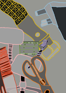
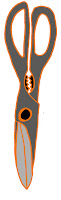
I next started to draw objects from my own household, again pens. I carried on working in this way as I felt collaging them and drawing the detail in with black felt comfortable and I thought this technique worked quite well.
After drawing a handful of objects I sarted playing with composition and colour, again using the piece of work by Michael Craig-Martin as my inspiration. 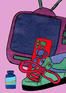


At this point came the first switch, I passed my piece on to Alex and Chloe had passed her first piece on to me.
 Chloe's Piece.
After Chloe sent me her work, I wasn't too sure where to go with it. I looked again at the piece of work we had chosen by Michael Craig-Martin and I realised that he didn't really leave much space within his image. So I decided to place some of my objects done in my style on top of Chloe's piece, using Photoshop.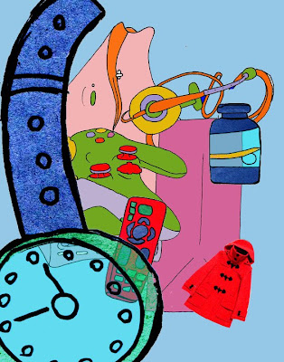

This is what I came up with.
I palced my images of objects I had created on top of the piece, placing them in spaces and on top of other objects, using up more space as Craig-Martin does.
The objects created by myself and Chloe were done in very different styles and you can tell which object were done by who, my objects give a slight texture to the piece which gives it an interesting effect.
I again passed this piece on to Alex and Chloe passed on her next piece to me.
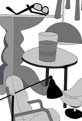 I really liked this piece of work, I thought the different shades of black and grey worked really well. I also like that some objects look less flat than others, they look slightly 3D which gives the image more effect.
I tried to work in a similar way I was working using black and grey papers, but It didn't work very well (and I ended up throwing it away). After this I changed the style of my work, I started drawing the objects out with black felt tip and scanning them in. 

After this I played about on photoshop with compositions and colouring them in.


I think this worked well, but It didn't really relate to the piece that Chloe had done in black and white. I then thought about colouring my object images in black and different shades of gray as Chloe did, but having the outlines of the images indifferent colours.

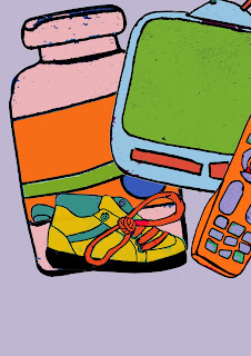
 After this I started making compositions with my images and using different background colours and scales to see which worked the best.