Firstly, with things such as the i-pad and kindle etc, which you can read books from, this challenges printed books, but with some things I think a printed book has more personality. For example, you can't do a pop up book on an i-pad? (unless it's 3D, which I my opinion is rubbish) and you can't have things like 'touch and feel' books for children, fun things which children like. Giving a book to some as a present, if it means something to them is special, downloading it to a computer isn't.
I love producing art digitally, and sometimes things look different printed than on a screen, but I much prefer to have printed book than digital books.
Something which is interesting for illustrators and digital books, prints etc is that illustrators can start to make their images move, creating little characters and using them in small animations, but should this kind of thing just be left to the animators out there?
Most images/illustrations that are published in magazines/books etc are somewhere online, but what we don't really know is if their being seen more online or in person?
I feel that reading a book to a child is much more personal than reading it from a computer screen, it's something to help people bond with children, computers/ipads etc should be left for the older children, you couldn't give a 5/6 year old an i-pad for them to look at pictures and try to read? And if you're asking, why not? Then, give a 5/6 year old an ipad, lets see how long it lasts before it doesn't break?
"Things weren't always this way. Before the digital revolution, life as an illustrator was fairly straightforward, or so it seemed - there was no Bill Gates, no Apple, no Photoshop, no Google, no internet, no email, no hassle. Looking back at life before the revolution, albeit through rose-tinted specs, the working day for your lone illustrator was a fairly simple affair. In fact, depending on just how far back you wish to peer, it's clear to see just how much has changed."
Take from Computer Arts magazine, November 2006.
I think its strange how different things were before most technology had been created, how different illustrators worked and got themselves seen.
I think the future of illustration will change, thanks to things like the i-pad and downloadable books etc, but I don't think many illustrators will be please by it, I would much prefer something hand held and printed than on screen, but that's just me.
Sunday, 30 October 2011
Web Site Research
Thinking about my own website that I would like to have, I would like mine to be very 'in your face', lots of bright colours and random illustrations everywhere. With funky boxes that link to things, instead of something that says "click here". I want it to be something you would want to look at as you want to see more, not something you look at because you have to. If a website isn't fun to look at, then I don't really want to look at it, and if there is lots of bland writing in big bulks then I probably wouldn't read it!
A web site I always love to check out is Tim Burtons, http://www.timburton.com/. I love the loading page and how he has illustrated the numbers into characters or has characters surounding the numbers. Dark yet colourful. Once into the website, theres a little animation which is interesting, you move a character onto different areas of the page, which lead to different things. This is fun but I don't think I would want this for my own website, though it is a good idea for Animators I guess.
Another website that I like is Julia Woolf's. http://www.juliawoolfillustration.com/. It's quite a simple site, simple tabs/links to other pages, but I like that as soon as you go on the page there is a nice bright eye catching image including typography.
Another is Dave Quiggle, http://www.davequiggle.com/. His work is to be seen everywhere on the page, even if its just little snippits of pieces hidden in the Contact box. The layout is very catchy too which I like alot.
I think even though people are checking out your web site to take a look at your work, your website needs to be quite eye catching aswell, will possibly help people to remember you, especially if they've come across your page by accident!
How ever much I love Eric Carles work, I feel his website is lacking in personality, http://www.eric-carle.com/home.html. I'm aware that it may not have possibly been Mr Carle who has designed the website but the lack of colour and imagination is capsized, it is just white with simple links to other pages. I don't mind simple links and simple things, but when everything is simple, it makes things quite limiting and not very rememberable.
I love this website by T.S Spooky tooth, http://www.tsspookytooth.com/. I love that little illustrations are links to other pages of the website, this is something I would like to have for my website, creating little characters to click on, something fun, friendly and inviting.
I've seen some illustrators websites where the background is just plain white and the text is black. I think this is pretty boring for someone who is artistic and creative. I feel that a website should reflect what it's about and it should reflect the illustrators personality and their work.
So I would like my own website to be colourful, crazy and abit 'all over the place'. With lots of textures!
Craig Oldham Poster

We were asked to Produce a poster for a talk by a designer called Craig Oldam. For this piece I thought i'd play around first with typography as I'm not very good at it so thought I could have a practice. And I came up with some text that I liked so I decided to use this. Having to come up with an idea pretty quickly as we only had a week of so to do this. I decided to have the text encoporated onto a computer screen as most designers/illustrators etc at some point use a computer to design their works, finish works or even just to scan images in and send them off!
Keeping it to a limit of two colours wasn't fun. I tented to make my computer blue, not sure why. Most computer are black/white/grey/silver. But those colours are abit boring when only usuing them with one other colour. So then after placing my text I just played around with the colour of it and purple was the colour that seemed to fit best with the blue computer. I then kept the background white (as that would be the colour of my paper) so I left some of the text white aswell.
If I had more time with this project I would have possibly worked on a better Idea and played with text and colour a little bit more! But overall, for a quick outcome, I actually quite like this piece.
Guru: Liam Bardsley
So we got to meet our Gurus a few weeks ago and my guru is Liam Bardsley. I sent him some of my works via email, A few pieces from 2nd year and then some I have recently been doing.
Hi Becca,
After this we got chatting about influences etc. And hopefully I'll be able to send him some more work in the next couple of weeks!
Hi Becca,
How's your half term been? I've had a look over your samples and have written some feedback for you.
First and foremost hang on to the textures and charm of collage in your work!
Killer Fashion
I really like this Illustration Becca. However there is too much charming collage going on. Charming collage always works great providing you don't overload the image with it. Geometric straight shapes done using Illustrator/photoshop would provide balance and contrast so we can appreciate the collage more, but it has to appropriate to the element you're representing. The pink lipstick at the front of the gun is lovely but the silver case it's emerging from needs to be straighter and more perfect (as wobbly can look amateurish as opposed to professional) - have you considered producing this part in Illustrator? The handle of the gun would look better straighter as opposed to ergonomically friendly! Looking at the perfume bottle could do with looking 3D as it looks like a sticker. I think your use of textures provides a very organic, human feel to your image that you need to keep. Are you influenced by Eric Carle by any chance?
Junctures 2
Once again a really nice image however not without it's faults though. In terms of the idea I am questioning whether the icon/symbols (eye, faces, skull, dummy etc) are necessary above the spinning ones. I realise this may be evident on a real fruit machine but in relation to art I think we can afford to remove these. As long as the main icons are visible on the spinners then you've communicated them to the viewer already - just don't say things twice is what I'm getting at. What do you think? Looking at the hold 3 buttons be careful of elements that need to straight and precise as opposed to charming (like in the Killer Fashion image) again. Are the face characters both men? I'm not sure whether the longer haired character is a man or woman? lol.I think if it is a woman then accentuate parts of the face to make them more feminine and then you've done it!
Junctures 3
There is no doubt in my mind that you have a mind that is capable of coming up with lateral ideas. This image looks to me like a wheel of fortune? I think choice of colour is an issue in this image, the muddy grey is a bit dull if I'm honest, the red's are lovely. Looking at the heads I can see a white outline around them - is this inadvertant or done on purpose? I think you could do with losing this line tbh. Like in the Killer fashion image why not have a go at representing some symbols as precise computer rendered to balance out the collage?
Dia de los Muertos title page
Have you looked at Nicky De Saint Phaille's work before? This reminds me of her work.
Not a favourite of mine this mainly as it is far too busy even with a fainter opaque background. I think what destroys this image is the black line around the shapes, it can make things look cheap and tacky.
Twinkle page 9
Very experimental use of shapes for the animals heads, not sure they work though. I love the cat's whiskers and their' eyes! Once again the use of an outline (even though it isn't black) could afford to be discarded. Do you work with other textures? I think it would be well worth having a go to come up with a wider resource of textures to dip into and put into this image. Just look at the different things going on - grass is different to animal hair, tree bark is a different texture to leaves. Just have a real play and could up with more diverse, contrasting textures! What about the colour of the sky too?
Twinkle page 6
I think this image could well do with a bit of collage going on. It looks solely computer rendered. Compositionally though I think it's good that this is lateral resulting in memorable (important in Children's books) just don't like the way it's been put together - bring back the charm! lol
Twinkle
Having looked at twinkle again I'm not sure about the shape of the head. I'd collage it personally and perhaps make him/her look a bit rougher?
Summary
More and different textures
Balance computer rendered shapes with collaged (where appropriate)
Don't say things twice
Get rid of outlines!
Hope this is helpful for you. Please ask me any questions to elaborate further once you've soaked up my feedback. Then we'll move onto to emailing more newer work over for me to look at! Ps do you have a skype? We can talk on there too if you like?
Cheers
Liam :-)
Some very helpful advice here from Liam. Specially from the 2nd year pieces which I do love but want to make them stronger for my portfolio. We had a breif chat about my Twinkle book and I explained why I've only used 1 texture and colours etc etc. This was my reply
Hey Liam, thanks for the feedback. I don't have skype, I use old fashioned MSN (sad I know).
Firstly, Junctures. After looking at them properly again I agree with everything you've said. I think the fruit machine would look much better without the icons etc. I think I just put them in to fill up space tbh! which I know I shouldn't do.
and the roulette wheel, I tended to go for the grey colour as I wanted to stick to original roulette wheel colours, (red,black,green) but I thought black might be a little too dark? Do you think I should try changing it to black? And i've only just noticed the white line around the faces, Not sure what that is but i'll deffinatly be getting rid of it!
The killer fashion piece was a piece I did when I was first starting to develop a style and I realise that it is a little messy and Ian mentioned that I could maybe re-do some of it to make it look a little neater, my Works never been very neat (not sure why, I think it's just the way I am!) but i'm working on it!
Gonna start to re-visit these pieces as I do like them and would possibly want them in my portfolio.
With the twinkle pieces, I tended to stick to the same texture 'cause every time I tried to add different textures they just didn't fit together at all, and I was struggling with it a little bit, but Ian said he thought it looked alright as Its for a childrens book and he didn't want me going too over the top with different textures. (There are a few different textures on other pages). But I'm gonna keep practicing with textures, starting to put together a little texture book and hopefully I can start using more than 1/2 textures in different pieces of my work.
Ian also thought it was best for me to leave some background colours white as it took focus off my characters and elements, which I agreed with, everything looked too clustered.
And the outlines on the twinkle piece I've used as things started to look too flat without them :\ but I might try getting rid of some and see what things look like then :)
And my half terms been very busy, Ian gave us 2 more projects to do just being we finished! Hope you are well :)
Thanks again!
Becca.
After this we got chatting about influences etc. And hopefully I'll be able to send him some more work in the next couple of weeks!
Tuesday, 18 October 2011
Portfolio Visit 1 (email)
After speaking to Tansy Myer, she agreed to taking a look at some of my work, though as she lives in America and I live here in England, obviously would be abit hard and alot of money to meet, especially just for a portfolio visit. So I sent her some of my works via email. I sent her, my Gun, Fruit Machine and Roulette wheel from last year, and some skulls and my twinkle character from the work I had done so far this year. This was her reply.
Hi Becca,
She's given me some great tips and advice which I will deffinatly be taking on board, and I thank her so much for taking some time out to take a look at my work and get back to me, such a lovely women and a fab illustrator!
Hi Becca,
Nice work! I love your use of texture and color in your illustrations. It almost gives them a paper cut or wood block feel to them. The flat perspective also contributes to this wood cut feel.
I think you should go even further playing with texture. Maybe even try textures/patterns that relate to the subject matter. Create your own textures, photograph or scan them in. I can see this being something really cool for you. Would work especially nice for a fashion piece.
Your color palette is very bright and fresh - I really like the pinks/reds contrasted with the silver/grey in killer fashion. Different tones of the same color range give this piece a sophisticated look.
Don't forget that for editorial it needs to be eye-catching and pull you into the story- Junctures works really good for that. I love the color and look of Killer Fashion the most but I wish something a little more "killer" could have come into play besides the brass knuckles. My feeling is art directors can always pull back from what you've given them, so I'd rather go over the top and edit it down. Don't play it safe.
I would also suggest playing around with some layouts that use negative space. Maybe try to do this one with a piece that relates to an emotion or a feeling. Just a thought.
Again, great work Becca. Keep pushing yourself and pushing boundaries for yourself, trying new things and always do what you love. Challenge yourself, but don't force yourself to love something if you don't.
I hope this been helpful.
Cheers,
Tansy
She's given me some great tips and advice which I will deffinatly be taking on board, and I thank her so much for taking some time out to take a look at my work and get back to me, such a lovely women and a fab illustrator!
Thursday, 6 October 2011
Critical Review 1
Arictal taken from Eye Magazine, summer 2011.
by David Crowley.
Handwriting is a touchstone in the history of graphic design, where lettering meets the messy reality of the human body.
Out of hand.
http://www.eyemagazine.com/feature.php?id=194&fid=878
The aritcle is about typography, and how hand written type is more personal and digital type seems quite bland and boring. I thought it was quite interesting as I have never been any good at typography and this makes me feel that hand made typography is much more personal and fun. I have to come up with a type for my childrens book (title etc.) and i know if i used a digital type it would look very plain and not so attractive to younge children.
An exhibition I would reccomend is the Alice in Wonderland exhibition at the tate gallery in Liverpool, which starts on the 5th november to the 29th January.
It goes through different adaptations of the story, illustrators/artists who have tried to make their own alice in wonderland pieces.
I love Alice in wonderland so I intend to go to this exhibition.
A film I would reccomend, is The Lovely Bones, very unusual film, thriller/drama/fantasy. About a young girl who gets murdered and she looks over her family and her murdered from an unusual place. Very strange film but I quite enjoyed it.
I'm not a very big reader so I do not have many books to recommend, but my favourite book ever is The Melancholy Death of Oyster Boy and other stories, by Tim Burton. Great book full of little poems written by Burton with strange unique characters also illustrated by him. Love it, massive fan of Tim Burton, just a quick little book that can be read in less than half an hour. I love the characters that much that I have 2 of them tattooed!
Monday, 3 October 2011
"Cute Illustration" Book from Monsa


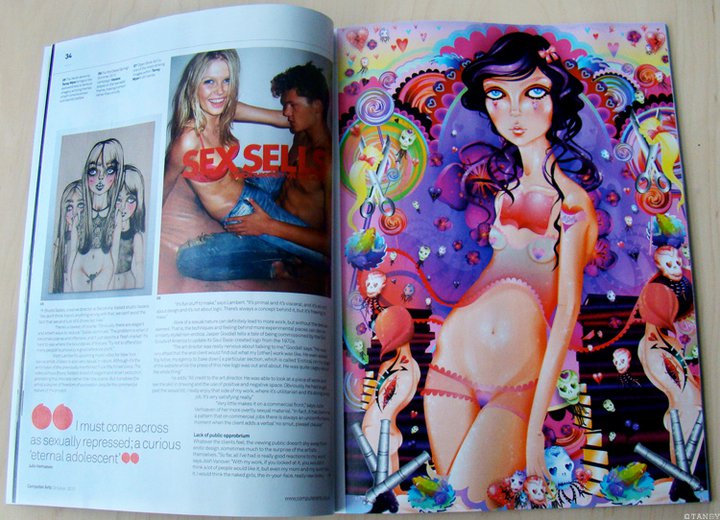

Monsa Publication, publicated a magazine/book called 'Cute Illustration'. It contains illustrations from illustrators everywhere, cute images including some work from Tansy Myer who I contacted last year, we became friends on facebook and I have been spying on her since :)
I don't feel like I am all that great at drawing/illustrating people unless they are sketches, and even though me and Tansy have completely different styles of work I find her illustrations of girls, brilliant. They are unique and unusual. Some of her works are very sketchy and some very colourful and illustraty.
I love that most of the faces she illustrates are out of proportion, the eyes are always huge and dominating. All of the girls are slightly different, with hairstyles and clothing. Lots of detail are put into these girls which makes them interesting. Her use of colour is also fantastic and eye catching and works well with the drawings.
Tansy's work has also been published in a Computer Arts magazine, sex and design issue as some of her works are very feminine, looking at the naked female body. Also her work has been puslished in 'girly' magazines such as Cosmopolitan and teen vogue, her work has been used to advertise shoes and trainers such as sketchers and rocket dogs.
Tansy has agreed to look at some of my work and give me some feed back :)


Zine project
Decided to do my zine publication on The day of the dead, Dia de los Muertos. I ended up creating a variety of skulls and putting them together in a hand made book. I chose to put together my book by hand as it shows my personality more, I'm not a very neat person so I didn't want my zine to look perfect and neat so I thought the best way would be for me to do it by hand.


Subscribe to:
Posts (Atom)