Friday 26 November 2010

Kinetic Final Piece


So...

After being off for a few weeks, due to personal issues. I was looking forward to coming back and getting stuck into a really exciting new project. The next project, is, Dialogue Ignites Change: Conflict/Resolution, Which I am not completely understanding just yet, but hopefully after today I should understand what I'm doing, but honestly am not looking forward to doing it. I wanted to actually be able to sit and do some Illustration work -.-

My group got our marks for the Kinetic Project, which were not the greatest marks being honest, but hey, I got 40, so at least I didn't fail.

Also got my mark back from the first essay we did for Critical Studies, which I thought I had possibly failed, but I got 53% so yay. (Beats my essay score last year too) but I've never been good at essays so I'm happy with this mark.

Monday 1 November 2010

Kinetic Art, responding to music.

(Responding to metal music, angry, loud, in your face)

For our group project, The Kinetic brief. After going through a few ideas within the group, we decided we were going to do a kinetic art piece, by using mark making with a variety of different media and materials. The mark making would be formed from our responses to music and noise. So over the half term we all went our seperate ways and tried out different types of mark making, listening to different styles and genres of music, to get different feels and outcomes within the seperate pieces of work. These are some of the mark making pieces that I had done, trying to respond to musc in different ways, such as the mood of the song, the beat, tempo, lyrics or even expressing different emotions.


Norman Perryman

Norman Perryman is known as a Kinetic Artist/Painter.

In 1973 Perryman began to work as a performing artist on glass plates, placed on a series of overhead projectors, interpreting music visually in real time. In contrast to the trend of creating digitally generated video-projections, Perryman has developed an economic low-tech alternative that retains the sensual organic qualities of the colours and the gestures of painting by hand. The light of the overhead projectors shines through Perryman’s glass plates to give the transparent colours an extraordinary luminous intensity when projected on a giant screen. As they listen, the audience watches the evolution and dissolution of Perryman’s abstract images. The magnified images from five or more projectors are mixed by hand with an analogue dimmer. Perryman’s semi-abstract, lyrical expressionist visuals are not illustrations, but rather images keyed to the ideas and feelings of the music, enriching the musical experience yet remaining in the memory as powerful works of art in their own right. Perryman calls this art form kinetic painting, because it is a continuously changing sequence of colours and forms that only exists in real time, then disappears forever. His paint-brushes also move to the rhythms of the music and make the liquid watercolour splash, pulsate, pulsate, flow or spread continually.

Love this work my Norman Perryman, I think it is an unusal way of working and it looks brilliant, the use of colour is amazing and the 'loose-ness' of the work lets different moods/emotions come through within the seperate pieces.

Friday 8 October 2010

Lane Smith

Lane Smith is an American children's book illustrator and author. He illustrated a book by Jon Scieszka called 'The True Story of the Three Little Pigs' which I think is an amazing story, it is basically the story of the three little pigs but from the wolfs point of view.
I also love the story of the tree little pigs as a band named 'Uglu Kid Joe' have written a song about it, interpretating it in there own way which I really enjoy listening to and hopefully one day I would like to illustrate it or possibly do an animation from it.

Tim Burton Movie Posters

I love most work done my Tim Burton, I think he is very imaginative and interesting, I even love his movie poster, which i'm not too sure if he had designed them personally, but they include his characters and scenery so I think they are pretty interesting.

Even his dark work, and 'black comedies' are very imaginative, with crazy characters, unusual and inventive characters which all have different qualities.


His animations are even more imaginative. Using bright colours in scenes which in reality are no so bright, for example, Corpse Bride (to the left) is about the Land of the Dead, yet, the land of the dead according to Burton, is bright and colourful, and the real world is a dark and gloomy place.

These are two films that are happier and brighter, but have a darker side to them. I love the Alice and Wonderland movie poster (to the left) as there is so much going on it in and it is so detailed, also including some of the interesting characters.


These are two of Burtons, dark and 'scary' movies, which I think comes across in these movie posters due to the darker colours, with the colour red, which usually comes across as scary or dangerous etc etc.

Andrzej Onegin


Andrzej Onegin, another Polish poster designer. (As you can tell i'm really into Polish poster artists and designers)

Once again, loving the bold black blocks of shape and the unusual colour scheme, works really well in this era of design. Unusual and surreal figure designs. Bright bold background colours, grabs your attention. I am also keen on the pattern and repitition in some of his images.

Andrzej Klimowski

Andrzej Klimowski, polish poster designer.
Designs interesting
posters, using collage, creating random and unusual images. Very surreal and abstract way of working.


I used the images above as reference for my narrative sequence project. I think they are very interesting due to how random they are and that you could come up with many stories surrounding these images.

The image to the left: I find this image very interesting, the colours scheme works really well and the amount of space left makes the hand print image stand out effectively.
The yellow image below, again I find very interesting, the colours used are very striking and eye catching, makes you want to look at the image. Also the character created is very unusual and surreal.

Wednesday 6 October 2010

Jan Mlodozeneic


Jan Mlodeozeneic was a Polish graphics designer. He worked in posters, drawing, book and publication design, illustration.
In these posters I love the use of thick black outlines, simple shapes and they give off a rough feeling and hey are very 'in your face' which is why i am attracted to them. The images with the pink and white backgrounds do not have black outlines around the shapes and figures, i still think this works well as the colours make them stand out instead of the outlines.

Jan Pienkowski

Jan Pienkowski, is a Polish-born British illustrator and author of children's books. He is probably best known for his 'Meg and Mog books' and for his pop up books written by Helen Nicoll including Haunted House , Robot, Dinner Time, Good Night and 17 others.

http://www.janpienkowski.com/books/meg-and-mog/index.htm


I used to read Meg and Mog when i was young, (primary school days). I found them fun and interesting and i still do now even though they are children's stories. I think the characters and very imaginative and well desgined for children's characters, simple block shapes and lines, nothing too detailed. Also the colours used are simple blocked, bright, colours, these catch the attention of children. The black outlines make the images and shapes stand out which again catches the attention of young children. The fun characters are easily remembered by children and also the older children and even adults.

Jan Pienkowski also did some interesting silhouette work for some book covers.

I think these are really interesting. I love the bold black shapes and how they work so well with the coloured backgrounds. Very interesting. The backgrounds are very unusual, using different shades of one colour and blending them together, this brings the black foreground figure/image sand out even more and i love this process.

Eric Carle


Eric Carle is a children's book author and illustrator who is most famous for his book 'The very hungry caterpillar' which was published in 1969, he has illustrated over 70 books and many of these have been best sellers over the years.
Eric Carle’s art is distinctive and instantly recognizable. He usually works in collage technique, using hand painted papers, which he cuts to created bright and colourful characters and images. Alot of Carle's books are surrounded by nature and many animals, as most small children are interested in these things, he gives them something to learn about in his books.
I think his characters and fun and interesting and I cans ee why so many children love reading his books.

Tuesday 5 October 2010

Box Project: Part 1 Object Final


Made from waterproof Material, which was painted for other colours. Hand stitch as material was quite sensative so I didn't want to risk it ripping on a sewing machine. Straps also hand sewn on the back of the penguin back, with the wings made as small pockets. Bag opens at the head of the penguin, closed with velcro.

Leszek Zebrowski

I just thought these movie posters were quite interesting and different...

Playing with Illustrator


A penguin I created on illustrator, just using simple shapes, lines and colours. Found illustrator quite confusing and hard. But hopefully somewhere down the line I will get the hang of it and enjoy playing about with it.

Andrzej Krajewski: Polish Movie Posters

Andrzej Krajewski, Polish designer, graphic/illustration. Creates these amazing movie posters, very inspiring as I would love to create something like these for some of my favourite movies.
The Big Lebowski, great film, very random as is this poster. Love the colours used and the text is very interesting as it looks like it has just been done free hand, which gives the piece more personality. Love the black outline, brings out the images and figures.

Sex and the City, another film/series which I really enjoy (hard to believe i know), again love the colours and the black outlines, also love how simpley the characters are drawn/created. Also liking how the pink boarder expands at the bottom of the image which the text placed on top, works really well.
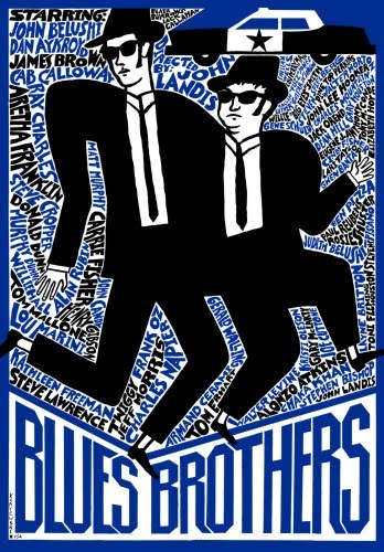
In the Blues Brothers poster, I love how thetext has been used as part of the background, very interesting.
The Reservoir Dogs poster, reminds me of work by Matisse, the colours and the bold black lines.

With this one, I love the tiny circles used as part of the background, gives it a comicy kind of style.This piece is abit different from all the rest, the outlines are not as thick as the rest and It looks as if it has been created on graph paper. I like the sharp edges and the darkness of the image.