The sequence had to be a minimum of six 'frames' or images. there were no restrictions in size, colour, or format of the sequence.
This was the image I was given.
 The first thing that caught my eye with this image was obviously the portrait photograph of a man, and the side view of the same man. the first thought that came into my head that was the image was a Mug Shot, possibly a criminal mug shot. The information on the image, is describing the man using weights and lengths of the mans body/head.
After thinking out some ideas I decided I wanted to work in a comic style and I started looking at the work of Jhonen Vasquez.
I love his style of
 work, very dark with strange stick like characters which strange personalities and unusual looks. i also love the amount of detail in his imagery and his stories are fantastic, written and illustrated well.
After looking at some of Vasquez's comic imagery I started to think of a story for my piece of imagery.
I came up with a story about a robber, using the mug shot image at the end of my sequence, as if the robber was 'caught' by the police. So I started working on a character for my story. 'The Robber'.


Once I came up with a character I stated to develop the story.
Firstly I drew out my mug shot frame, in a similar style to Jhonen Vasquez's work, using sharp edges and very rounded edges in certain areas, also my character is very 'stick man' like which gives his a unique look.
Firstly I drew out my mug shot frame, in a similar style to Jhonen Vasquez's work, using sharp edges and very rounded edges in certain areas, also my character is very 'stick man' like which gives his a unique look.
To create this style, I simply drew out my images and character with thick bold pencil lines, giving a scruffy look to my wor
 k. I then scanned my images into photoshop and used the 'Levels' tool to make my the lines of my images black, giving the images a dark, quirky look.
After this I started to work on the rest of my frames.
1. Robber planning his bank break in.
2. Robber about to break into a bank. (Outside a bank, dark, torch)
3. Smashing a window?
4. Finds money, happy!
5. gets caught by police, guns.
6. Caught, Mug shot.


After drawing out all my frames and playing about on photoshop with them, creating backgrounds and putting small bits of detail in them I started to think about boarders and how to put my 6 images together. Again looking at how Vasquez works, he uses many different boarders within his work. I first tried out a simple thick black boarder which worked well but I then tried more jagged boarder which I thought worked better with the theme of my images.
 After finishing putting the piece together, I felt there was something missing. I sat with my tutor and spoke about this piece of work and we both agreed that the story I had come up with was to straight forward and obvious and I needed to do something abit different with my imagery and maybe not tell a straight forward story. So I decided to keep working on this project. After thinking for a long while I couldn not think of anything else I could do with the pieces I had already created so I decided to start this project again and take it from a different approach.


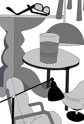
 This piece was my first final piece, I then passed this on to Alex and he then worked on top of this or worked in his own way using this for inspiration.


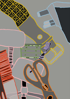
 I really liked this piece of work, I thought the different shades of black and grey worked really well. I also like that some objects look less flat than others, they look slightly 3D which gives the image more effect.


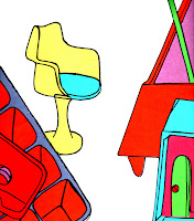
 After this I started making compositions with my images and using different background colours and scales to see which worked the best.